Creation of a family of special libraries based on the enterprise design system
In this project, we tackled the challenge of optimizing the design workflow to streamline the development of online customer applications within a global enterprise context. Aiming to improve efficiency and consistency across designer teams working for over twenty countries, our focus was on creating a family of specialized libraries built upon the foundation of the enterprise design system.
Problem Statement and Goals
While the enterprise design system provided standard brand guidelines, it fell short in offering precise guidance for specific application contexts. This resulted in several issues:
1. Inconsistencies: Different designers adopted varying approaches within the same user journeys, utilizing different components.
2. Discrepancies: Designers employed the same flow and components but with differing layouts, component sizes, and spacing.
3. Non-compliance: Sometimes, designers deviate from the design system by using inconsistent components, owing to the system's complexity and steep learning curve.
4. Due to these challenges, the UX design teams frequently encountered inquiries from product owners and other stakeholders, occasionally diverting their attention from the primary focus on user journey optimization, leading to discussions centered on visual appearance and minor details.
5. Furthermore, the development teams faced numerous queries directed toward the designers, as they operated on different platforms that exhibited their own discrepancies while aligned with the design system.
By addressing these challenges, we aimed to establish a cohesive and efficient design process that ensures consistency and adherence to brand guidelines across all applications and regions.
Considering Approaches
To solve this problem, our team considered two approaches:
A) Initially present UX project deliverables in low-fidelity renderings, then upon approval from the product owner, transform the prototypes into high-fidelity mockups for developers.
Pros:
•Decreases the workload for UX designers by eliminating the need for pixel-perfect mockups.
•Focuses discussions with product owners and their teams on UX flow.
Cons:
•It involves creating an extensive library of low-fidelity components, which can be a substantial project in itself.
•Demands the presence of an interaction designer to convert UX prototypes into high-fidelity mockups before handing them over to developers.
•It doubles the workload on projects, resulting in two versions.
B) Establishing a dedicated library of form sections and other large reusable parts of applications.
Pros:
•Accelerates the UX process.
•Streamlines the transition from UX mockups to development-ready assets.
Cons:
•Requires significant effort to develop additional libraries.
•Demands UX designers to familiarize themselves with these supplementary libraries.
The team opted for the second approach, which entailed significant initial effort but offered substantial gains in speed and consistency over the long term.
Main Challenges
1. Establishing a top-tier library derived from the foundational design system library, guaranteeing effortless synchronization with updates from the core library and ensuring user-friendliness for designers.
2. Fostering efficient communication among diverse design departments within the organization and forging strong partnerships with development teams to nurture a unified, trustworthy source of design assets.
Solution:
Preliminary steps
1. Conducted an audit of recent UX projects, categorizing the most common issues.
2. Developed a matrix outlining country-targeted applications and identifying reusable sections.
Realization steps
1. Evaluated the suitability of Sketch and Figma, ultimately choosing Figma due to its advanced features and algorithms, which aligned with corporate objectives.
2. The Design System team developed a Figma version of the existing Design Language System (DLS) library at the request of the organization's leadership.
3. Implemented a testing approach by selecting two projects nearing completion to pilot the new system.
4. Established the first release of the Acquisition Design System library to cater to immediate application needs.
5. Expanded the library to encompass all country-specific requirements, creating a cohesive family of libraries.
6. Facilitated communication with company management to establish connections with dedicated development teams responsible for creating a singular source of truth framework.
The Top-Tier Library project aims to revolutionize UX design by offering a hierarchy of Figma blocks, ranging from simple combinations of DLS components to comprehensive page templates. These templates serve as foundational starting points for new product designs, organizing pages into intuitive user journeys.
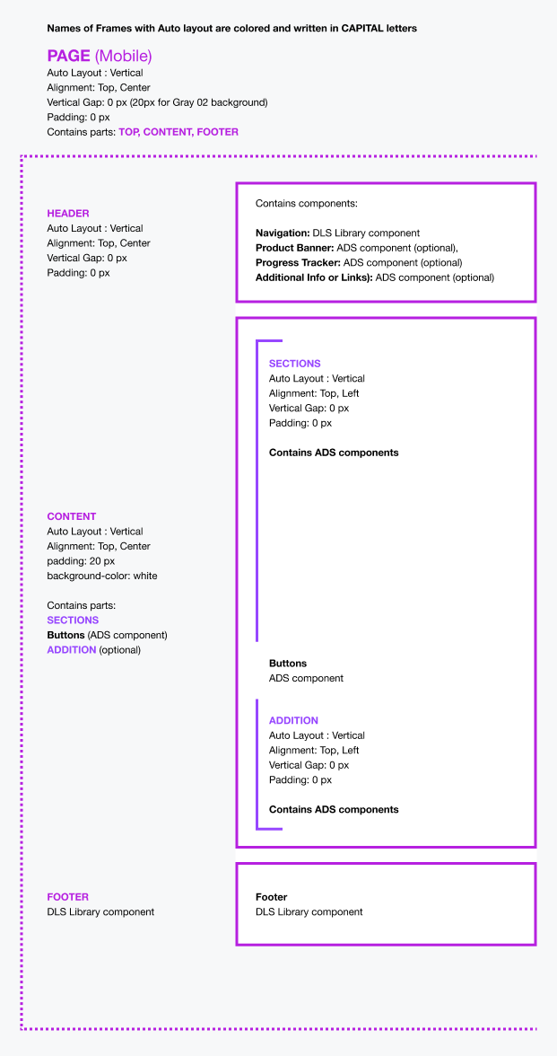
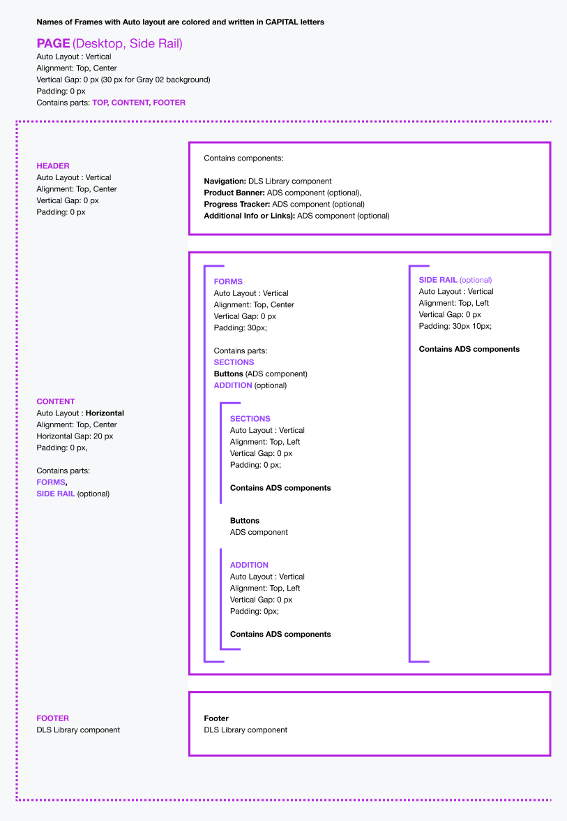
Leveraging Figma's powerful tools, the project implements a dynamic system of auto layouts. This enables UX designers to seamlessly utilize drag-and-drop functionality without the hassle of adjusting component sizes and spacing manually, as these parameters are automatically applied.
Illustrative schematics showcasing page layouts driven by auto layouts, highlighting their dynamic properties.


Empty templates thoughtfully constructed with auto layouts, ready to be customized and filled with content.
A comprehensive Figma page featuring screens from the pilot project application alongside accompanying templates for seamless integration.
Screens crafted in Figma accompanied by clear guidance for team members, indicating utilized sections and providing direction for implementation.
Outcomes & Lessons Learned:
Despite being an ongoing and extensive project with multiple iterations, initial results demonstrate a remarkable increase in the speed of UX design, alongside enhanced consistency across projects. While the development framework is still evolving, similar gains are anticipated in the development phase.
Throughout the project's lifecycle, we've gained valuable insights into striking the right balance between the feasibility and flexibility of Figma components. Our focus on ensuring ease of use and minimizing learning curves for team members has enriched our collaborative experiences and fostered efficient design practices within the company.