Infosario is a specialized service platform that was born as a startup within the portfolio of a partnership between the world’s biggest clinical research company Quintiles and pharmaceutical giant Eli Lilly.
Problem Statement and Goals
The problem of clinical research is not so much in collecting information as in the fact that huge amounts of heterogeneous information are difficult to process to make the right decisions and develop optimal ways to create new drugs. This is one of the reasons why it usually takes about 6-10 years for a new drug to enter the market.
The new service was created to help with this process, and as a result reduce the average time to market of new drugs by more than half.
Main Challenges of The Project
1. Inability to perform traditional competitive analysis and user research.
2. Create a product for a novel medium.
3. Make the interface not too complex and avoid cognitive overload.
4. Create new branding, a cohesive design system, and ready-to-use components for developers.
Challenge 1: Inability to Perform Traditional Competitive Analysis and User Research
Direct competitive analysis was not possible due to the uniqueness of the product. This was a novel concept for the clinical research industry, and there were not any similar services yet available.
Conducting full-fledged user research was difficult due to the small number of potential users and the difficulty of communicating directly with them, due to the specifics of their work.
Solution
• Rather than looking at whole products, we analyzed individual modules of competitors’ tools that performed similar actions.
• To get a better understanding of the users, we held several lengthy sessions with the creator of the idea for the product and SMEs, compiled questionnaires that were distributed to the potential future users, and analyzed the feedback.
• The first modules were made on the basis of assumptions after processing the collected information.
• The working parts of the product were presented for testing by SMEs and a selective number of potential users. We conducted AB-testing occasionally involving users remotely.
Challenge 2: Create a Product for a Novel Medium
The team had no previous experience making applications for large touch screens as a primary medium. At the same time, we had to allow users to run the same application on laptops and desktops.
Solution
•We conducted ergonomic research and tested how users tend to operate on large touch screens and defined how large these displays have to be so that working in any part of the screen would be comfortable.
• After some brainstorming sessions and high-level user research, an idea was born to use three large touch screens that functioned under the principle of a complementary framework.
• After several testing sessions we proposed an adjusted layout based on the research
• Due to the high probability of researchers spending many consecutive hours in clinical trial design jam sessions, the interface utilizes a dark theme with specially selected colors.
These are some initial sketches establishing screen size, venue plan and placement of main workspaces


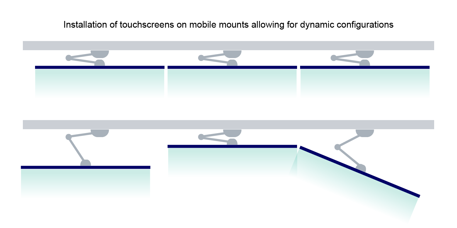
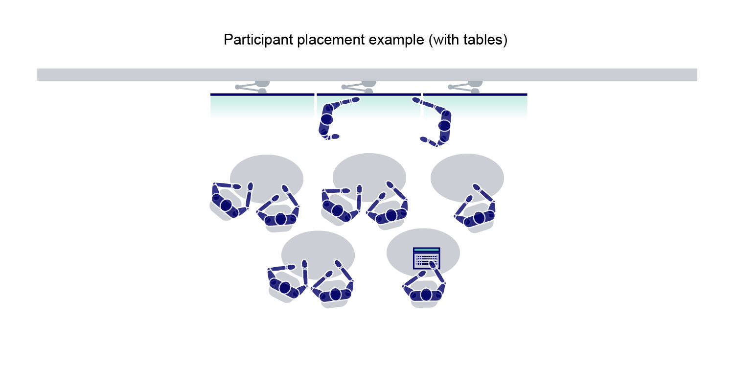
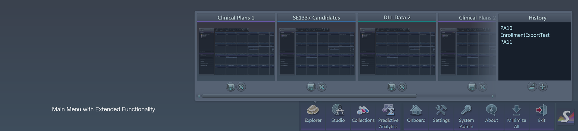
The collapsible main menu with extended functionality placed at the bottom of the screens
Challenge 3: Avoid Unnecessary Complexity and Cognitive Overload
It quickly became apparent that the product would be incredibly complex with many interconnected modules and features, high customizability, and dynamic elements.
Solution
•Focus on a framework that allows users to focus on one task at a time while also allowing them to see their actions in context as a part of a bigger whole. The tool utilized a node interaction pattern that visualized relationships between modules and let the users use their intuition as to how to navigate through the features.
UX Design Process
In this project, UX designers’ roles were combined with business analyst roles.
•Epics were created by the product owners or project managers on an agile basis following the project scope.
•After that, the UX team members created business requirements working with product owners and broken down the epics into a number of stories.
•As a next step, designers created flow diagrams and whiteboard initial sketches and discussed them inside of the UX team.
•The wireframes created based on initial sketches were presented to the product owners and updated iteratively.
In parallel, work on branding the application was carried out, which allowed after a few months to create style libraries and present UX flows with high-fidelity prototypes instead of raw wireframes.
In parallel, work on branding the application was carried out, which allowed after a few months to create style libraries and present UX flows with high-fidelity prototypes instead of raw wireframes.
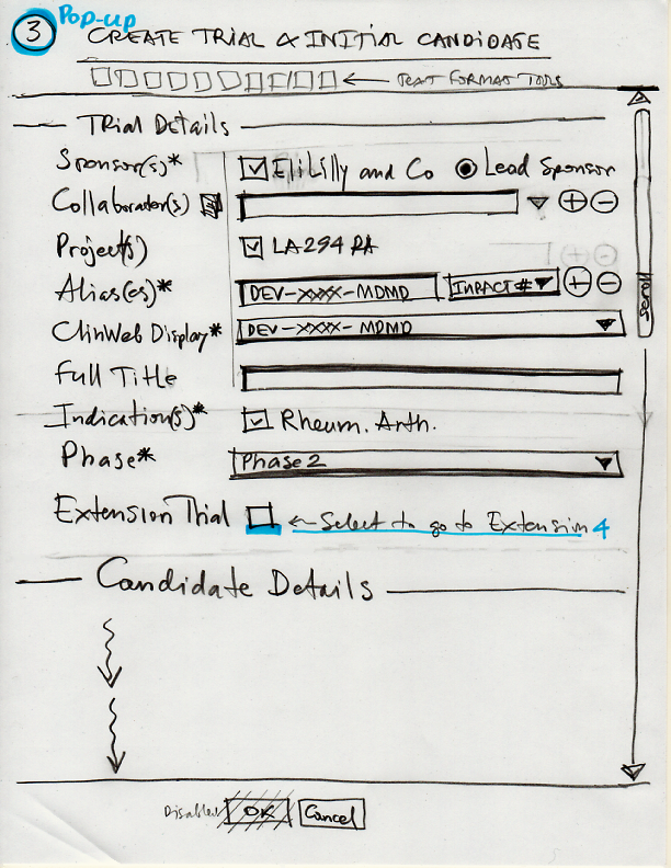
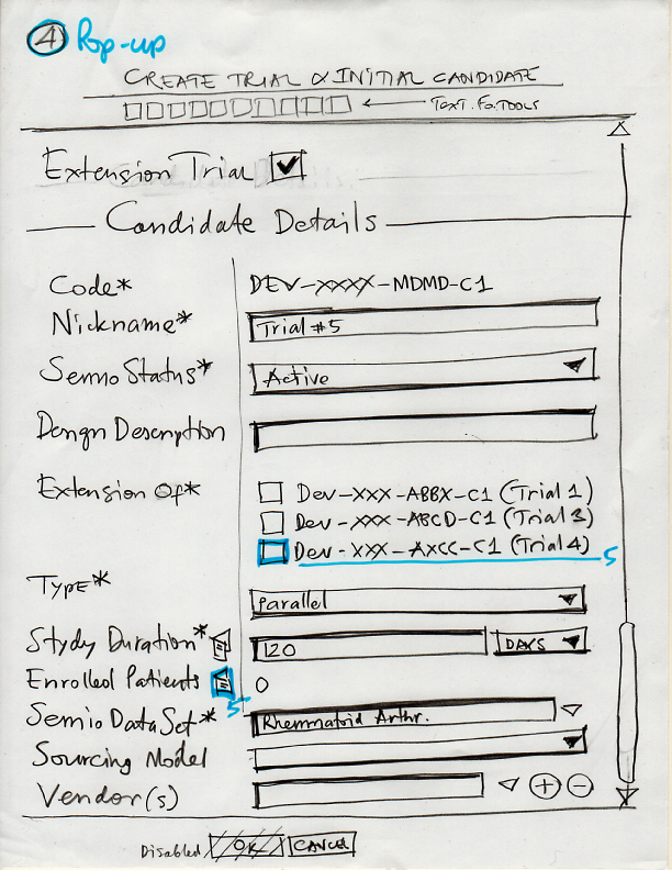
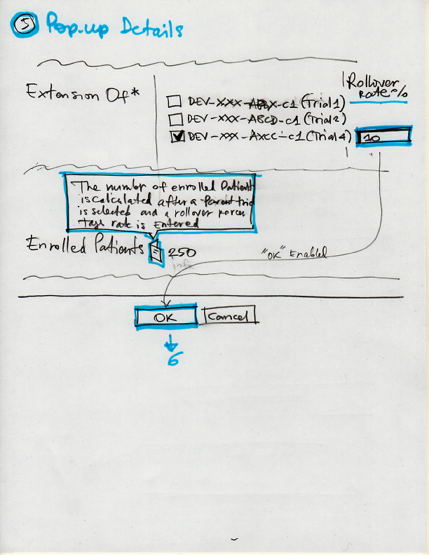
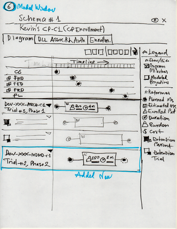
Samples of initial raw sketches

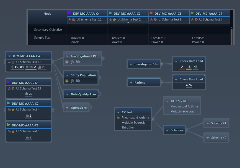
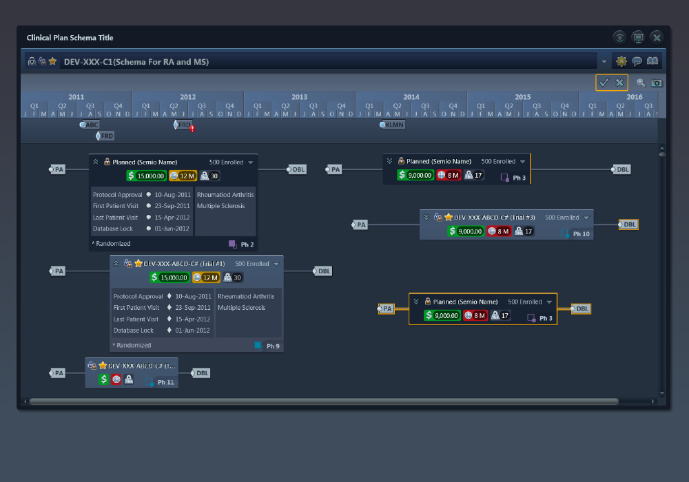
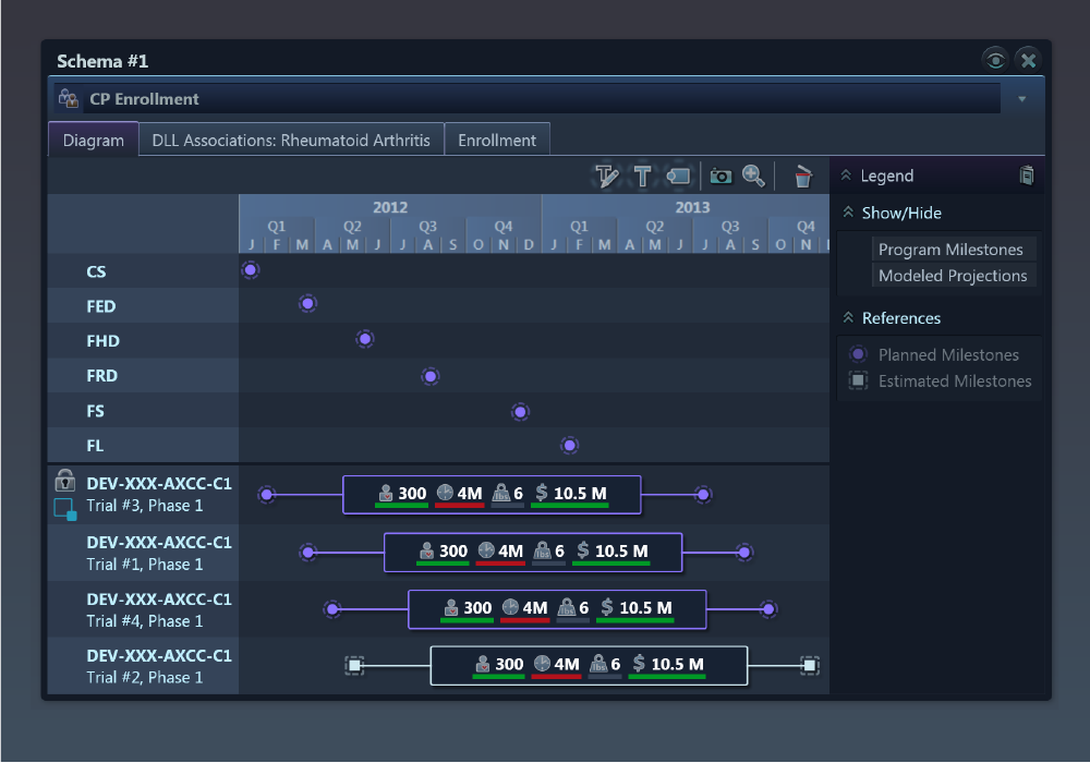
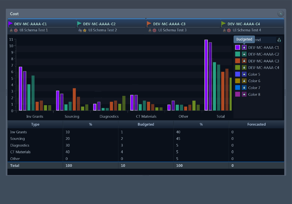
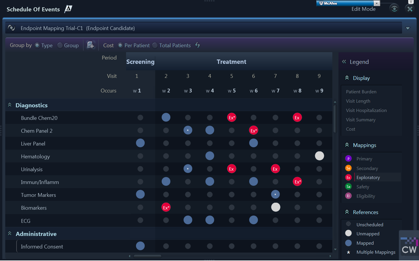
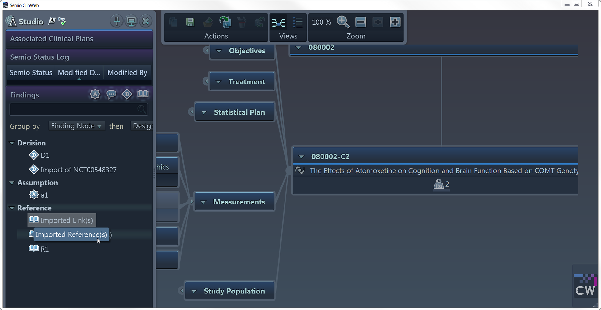
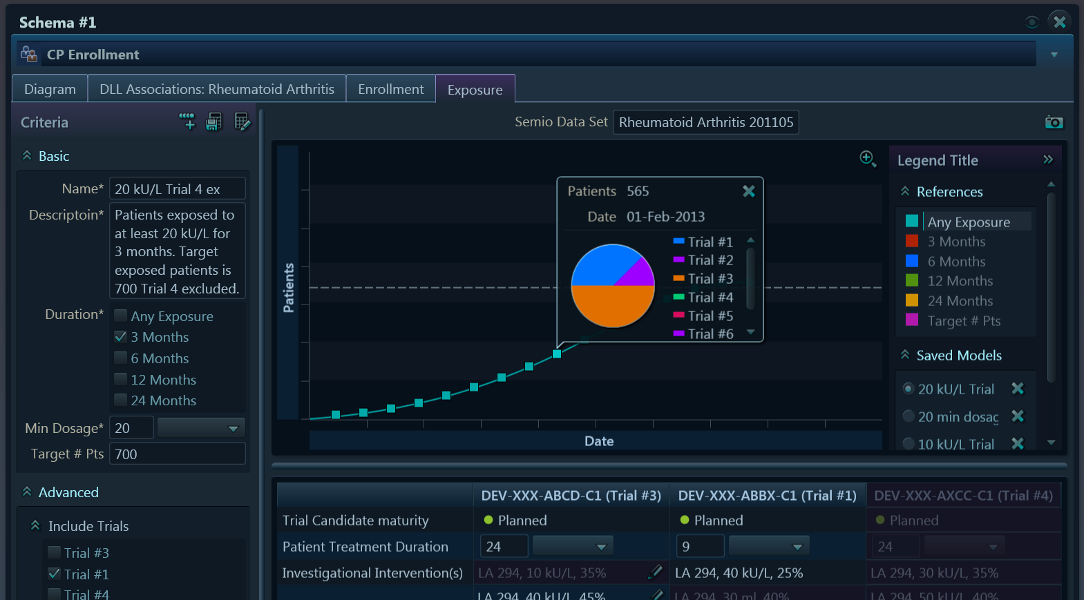
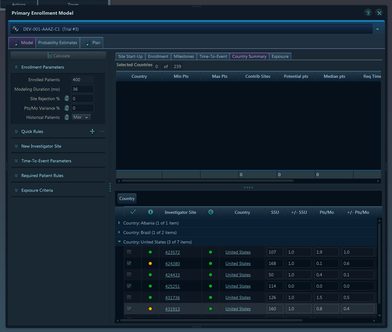
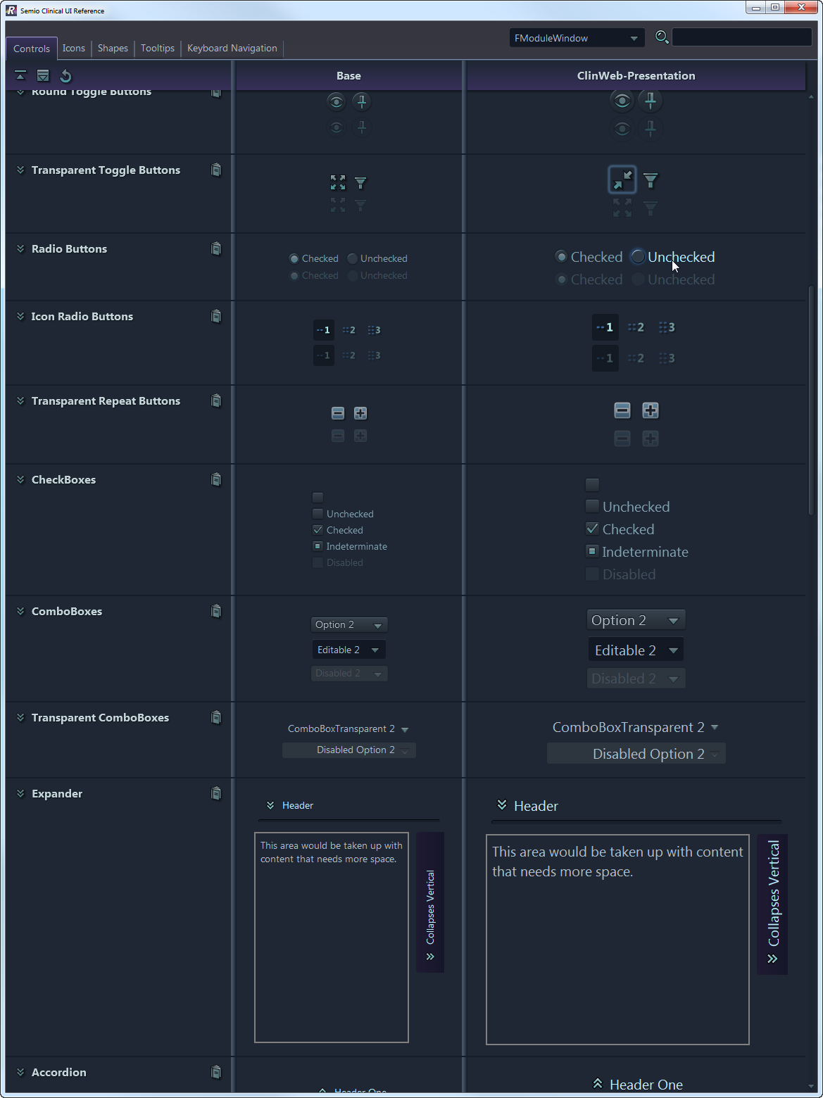
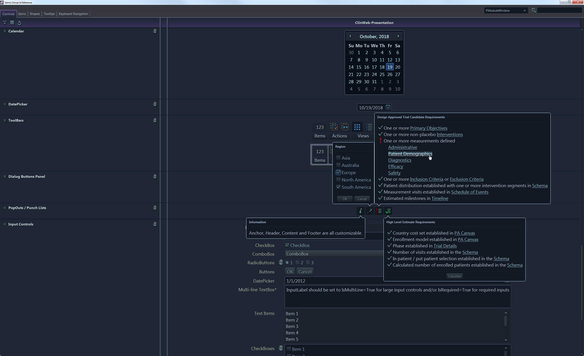
Screenshots from hi-fi simulation that present custom controls.


Challenge 4: Create new branding, a cohesive design system, and ready-to-use components for developers
Solution
•Using XAML, all Windows default libraries were restyled. A set of reusable custom-made controls was utilized as well.
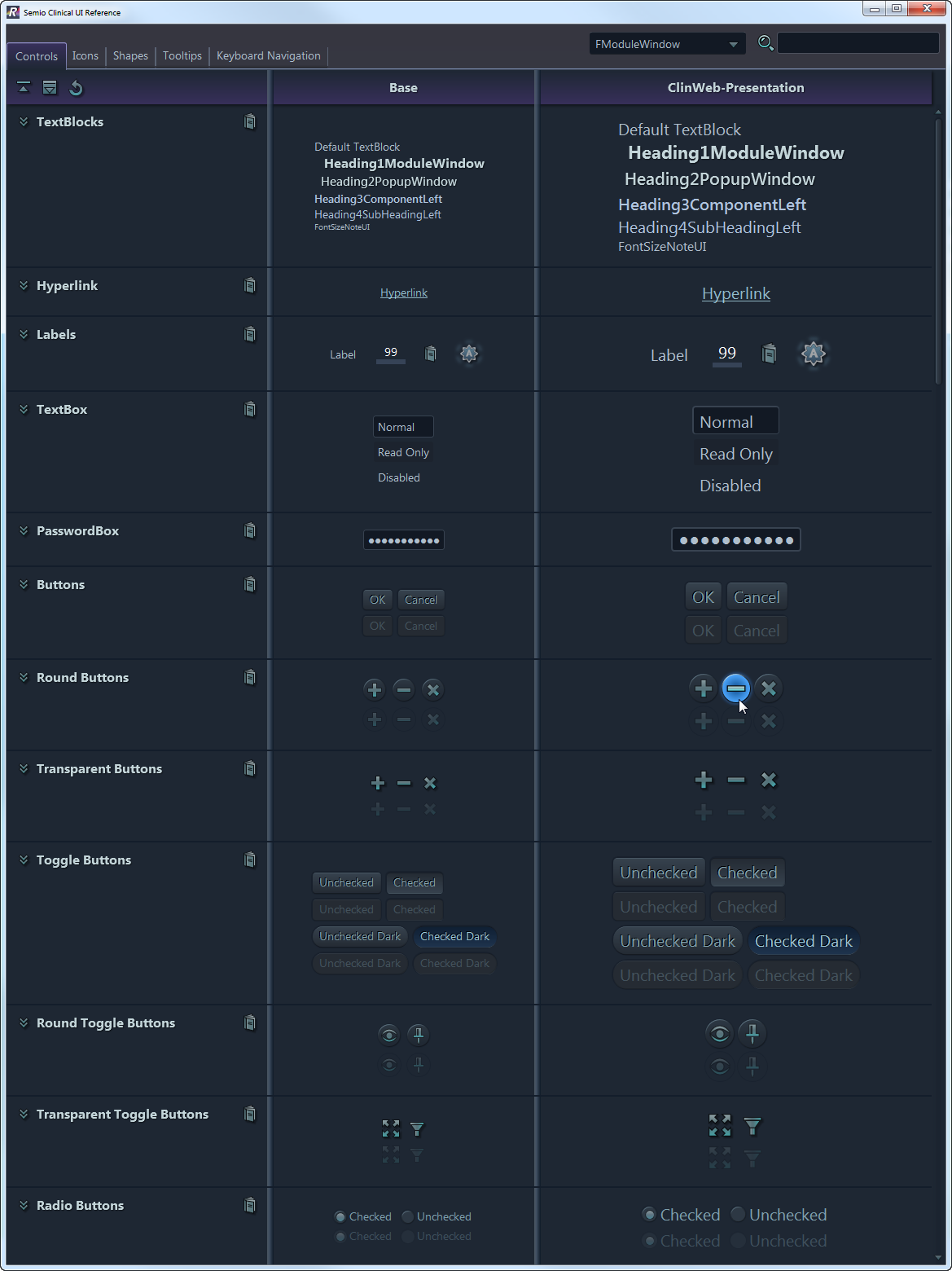
•Instead of a style guide, the team proposed an interactive reference application that supplied all information on icons and controls, allowed users to view and copy the XAML code of each element, and export elements in PNG format.
•The design system allowed for the development and update of the product without the continuous involvement of visual designers.

My proposal for and design of library structure.

This video is just a caption of the reference application.
Reference application screenshots.


Outcomes & Lessons Learned
Infosario service received an enthusiastic response from stakeholders and was highlighted in media as a creative innovation and important design breakthrough in the clinical research field.
Infosario - the biggest and most complex product I've ever been involved in creating. This taught me to anticipate the difficulties that may lie ahead when implementing large, long-term projects and combine various roles at different stages of the project.
Plus, it was a great experience working in a cross-functional team.